

Dark floral wall art gives a room a different kind of warmth. Instead of trying to make every surface bright, it uses deep color, shadow, and organic shape to create a place for the eye to land. A dark rose, inky leaf, plum petal, or midnight background can make a plain wall feel considered, especially when the rest of the room needs a little structure.
It is not a style that needs a dramatic house to work. Dark florals can feel polished beside light linen, calm against pale plaster, and surprisingly fresh with natural wood. The difference is intention. Give the artwork a real job, let it relate to the light and furniture around it, and resist turning every nearby object into a matching accent. This guide walks through the decisions that make a moody floral feel grounded rather than heavy.
Begin with the room’s existing contrast
Before choosing the darkest piece in the collection, look at the room in broad blocks. Where are the lightest surfaces? Where is the deepest tone? A dark floral works best when it adds a deliberate contrast instead of becoming one more dark shape in a crowded corner. On a warm white or pale greige wall, it can act like a crisp punctuation mark. Against a deeper paint color, it needs enough light petals, open space, or a reflective finish to stay visible from across the room.
This is why a dark floral can work in both a light room and a moody one. In a light room, it gives the composition an anchor. In a room with charcoal, navy, forest green, or dark wood already present, it can extend that depth while the petals provide detail. The useful question is not whether the artwork is dark. It is whether a visitor can read its outline and feel where the room’s visual weight is meant to sit.
Stand in the doorway and take in the largest shapes first: sofa, rug, wall, windows, and the artwork. If everything feels similar in value, introduce a lighter textile, lamp shade, or open patch of wall nearby. If the room feels pale and unfinished, a dark floral may be exactly the one confident note it needs.

Choose the floral mood before the exact color
Dark floral art can be romantic, tailored, quiet, graphic, or almost architectural. The subject alone does not decide that mood. Look at the composition. A loose bouquet with softer edges feels more relaxed than a close, high-contrast bloom. A formal rose arrangement can bring a little ceremony to a dining room or entry. A flower with plenty of background space may feel more modern and calm, even when the palette is deep.
Color helps refine the feeling. Burgundy and ruby tend to bring warmth and intimacy. Blue-black and charcoal can feel cooler and more graphic. Dark green links naturally to wood, plants, and antique brass. A black background with pale petals makes the artwork read clearly from a distance, while a fuller field of red or plum can make a room feel more enveloping. None of these directions needs to dictate the whole room. Let the art establish the mood, then pick up one restrained note elsewhere.
A simple way to test the direction is to look at the art beside the furniture, not in isolation. Dark roses next to a clean-lined cream sofa might feel elegant and a little dramatic. The same roses beside tufted velvet and heavy curtains can feel richer and more traditional. Neither is wrong. The goal is to choose the degree of visual volume that fits the way you want the room to feel when you walk in.
Let the furniture set the scale
Because dark colors carry visual weight, size matters. An artwork that is too small can look like a dark dot above a generous sofa or sideboard. One that is too large can press against the room before visitors have a chance to appreciate its details. Start with the furniture beneath the art. It gives the artwork a natural boundary and makes the whole arrangement feel anchored.
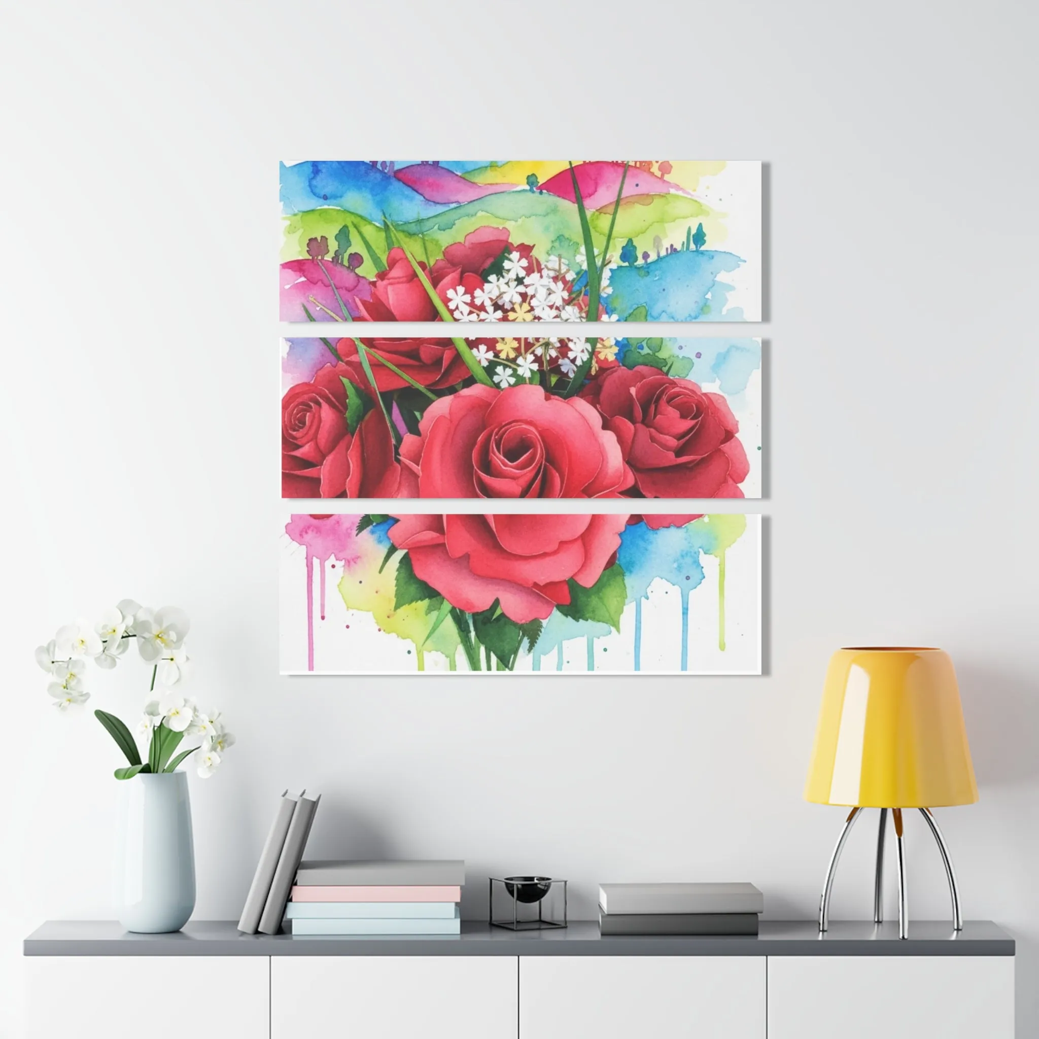
Mark the outer edges with painter’s tape before hanging or ordering. Then look from the doorway, your usual chair, and the other side of the room. The painter’s tape will tell you more than measuring alone because it shows the actual shape the room will see. If a single piece feels narrow for the wall, a connected group can carry more width without becoming one solid block. If the wall is slim, a vertical composition can add height without forcing the art into nearby doors, lamps, or shelving.
Pay attention to the negative space, too. A dark floral needs quiet around it. Leaving open wall at the sides and above lets the composition feel intentional and allows the petals, stems, and color shifts to be discovered rather than swallowed by surrounding decor. For another useful way to judge proportion, the studio’s guide to large flower wall art explains how scale changes the role a piece plays in the room.
Balance drama with material and light
Surface changes how dark floral art behaves in a room. Canvas has a softer, more tactile presence. It works well with linen, wood, woven shades, and spaces where you want depth without too much shine. Acrylic can make dark color feel clearer and more luminous, particularly where the art catches daylight or lamplight. Metal has a clean edge and a little reflection, which can help a deep palette feel lively in a smaller entry or a room that does not get much sun.
Look at the wall at the time you use the room most. A piece that feels balanced in full afternoon light may read quite differently after sunset. You do not need a complicated lighting plan. Simply notice whether the work will have a lamp nearby, whether it faces a window, and whether the room’s evening light is warm or cool. If the wall is naturally dim, choose a floral with a readable silhouette or a little lift in the petals. If the wall gets strong light, a rich canvas or a deeper floral can help the room feel settled.
Material around the art matters as much as the finish of the art itself. A wood console, a woven chair, a brass lamp, or a creamy ceramic vase can soften the intensity of deep roses without making the room precious. You need one or two relationships, not a theme. When every pillow, object, and wall color repeats the art exactly, the room loses the natural contrast that made the floral compelling in the first place.

Give dark florals one clear companion
Dark floral wall art does not need a collection of matching accessories. In fact, the room usually feels stronger when the art gets one quiet companion instead. Pull a single small note from the composition: a brass tone from the frame, a berry shade from the petals, a blue-black detail, or the green of a stem. Repeat it once in a book spine, vase, cushion, or lamp base, then let the other surfaces do their own work.
This restraint keeps the floral from feeling costume-like. A dark artwork can bridge pieces that do not initially seem connected. It can relate a black metal lamp to a warm leather chair, or give a pale sofa a relationship with darker dining chairs across an open room. The artwork becomes the visual thread, not an instruction to buy more things in the same color.
If you are styling a bedroom, favor softer adjacent materials and leave more breathing room around the bed wall. Dark florals can still feel restful when they are balanced by bedding, wall color, and lower visual clutter. The studio’s bedroom wall art guide has more on choosing a composition that supports rest. For a living room, you can often use a larger or more saturated piece because the space is viewed from farther away and needs to hold its own beside seating and conversation.
Use the right wall, not every wall
One dark floral is often enough to establish a mood. Choose the wall where the room naturally wants a focal point: above a sofa, bed, sideboard, desk, fireplace, or a clear stretch in an entry. These positions give the art a job. It either anchors furniture, greets visitors, or adds depth to a place that would otherwise feel blank.
Be selective with smaller or more interrupted walls. A dark piece can work beautifully beside a doorway or at the end of a hall when it has a clean edge and enough open space around it. It is less successful when it is squeezed between several shelves, switches, framed photos, and competing patterns. If the room has one strong floral already, allow other walls to be quieter. The contrast makes the focal piece more satisfying, not less.
For people who prefer a collected look, a small group can work as long as it has a visible thread and a clear outer silhouette. Keep the spacing consistent, use related tones or finishes, and avoid adding pieces simply to fill every inch. The studio’s floral gallery wall guide can help you plan an arrangement that feels personal without becoming busy.
Find dark floral wall art with a real point of view
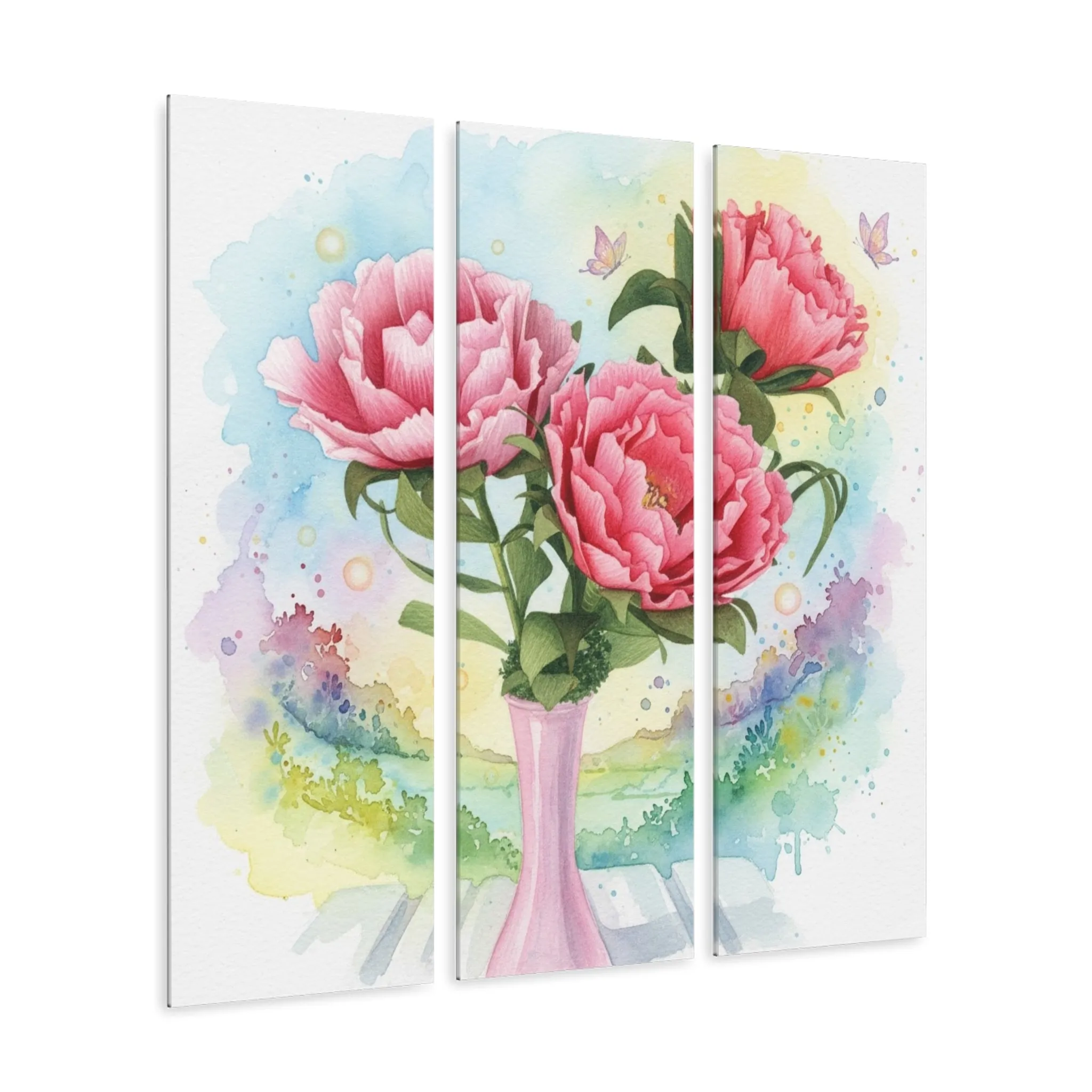
The most successful dark floral wall art is not simply the darkest thing in the room. It has a role: to anchor a sofa, give an entry more character, bring depth to a bedroom, or make a dining wall feel more complete. Start with the room’s contrast, choose a floral mood that belongs there, let the furniture set the scale, and give the artwork a little open space to breathe.
Artisan’s Studios offers floral wall art in acrylic, canvas, and metal, from blue-black roses to saturated ruby bouquets and lighter floral compositions. Browse the full wall art collection, explore the studio’s rose wall art collection, or compare room-specific ideas in the living room guide before choosing a piece.
Frequently asked questions
Where does dark floral wall art work best?
Dark floral art works especially well where a room needs a clear focal point: above a sofa, dining sideboard, bed, desk, or fireplace. It can also give an entry or reading corner more purpose. The key is to leave enough open wall around it so the composition feels deliberate rather than crowded.
Will dark floral wall art make a room look smaller?
Not when the artwork has a clear role and enough contrast. A dark floral can create depth on a pale wall, and it can remain lively on a dark wall when its petals or background have lighter notes. The problem is usually too many competing dark surfaces, not one well-placed artwork.
What frame or finish works with dark floral art?
Choose the finish that suits the room’s other materials. A crisp acrylic surface can heighten color and definition, canvas can soften the mood, and metal can add a clean reflective edge. A simple dark, natural wood, or warm metallic frame can connect the work to nearby furniture without competing with it.
How do I style dark floral art without making the room feel gothic?
Treat the artwork as one strong note, then keep the surrounding choices calm. Repeat one small color from the piece in a lamp, book, vase, or textile, and let the rest of the room breathe. Light upholstery, natural wood, linen, and clear wall space can all balance a darker floral composition.
Related posts

Related reading
How to Create a Floral Gallery Wall That Feels Collected
Build a floral gallery wall with an easy layout, a clear visual thread, and art that feels personal.
Related reading
Floral Wall Art for a Living Room: A Practical Guide
Choose floral wall art for a living room by balancing scale, color, light, and the way people gather there.
Related reading