

Pink floral wall art is not limited to one kind of room. It can be the soft note that warms a neutral living room, the detail that makes a bedroom feel personal, or the confident color moment that brings a quiet entry to life. The difference between an artwork that feels considered and one that feels accidental is rarely the flower itself. It is the way its pinks, scale, finish, and surrounding materials relate to the room.
Start by treating the artwork as part of the room’s color story, not a last-minute decoration. A good floral piece gives the eye somewhere to rest, then rewards a closer look with petals, stems, and texture. This guide walks through the choices that make that happen, so you can choose a pink floral artwork that still feels right after the first rush of color has worn off.
Start by naming the pink you actually want
“Pink” covers a much wider range than most rooms can carry at once. Blush and dusty rose have gray or brown undertones, so they sit easily beside cream upholstery, oak, aged brass, and warm white walls. Peachy coral pinks bring more heat. Raspberry and magenta have more visual energy, and they can hold their own against darker furniture or a dramatic wall color. Before shopping, look at the artwork from a few steps back and ask which family is doing the work: soft, warm, cool, or saturated.
That question makes the rest of the room easier to read. A warm floral usually feels at home with oatmeal, putty, linen, tan leather, and honey-toned wood. Cooler pinks can work beautifully with crisp white, charcoal, blue-gray, or pewter. The useful move is not matching every shade exactly. It is repeating one quiet tone from the artwork somewhere in the room, then giving the eye a calmer neutral around it. A recent floral color-pairing guide makes the same practical distinction between warm and cool floral palettes.
If you are hesitant, choose the softer version of the color you already like. A pale pink flower with a warm background can be more flexible than a highly saturated all-pink composition. You still get the lift of color, but the artwork has room to stay interesting as pillows, rugs, and seasonal branches change around it.
Let the wall and furniture decide the scale
Scale is what makes wall art feel placed rather than simply hung. Measure the furniture below the artwork first, whether it is a sofa, headboard, console, desk, or dining-room sideboard. The artwork should create a visible relationship with that piece. Center it to the furniture, then leave breathing room at either end. On a generous wall, one confident floral composition usually has more presence than a scatter of small frames trying to make the same statement.
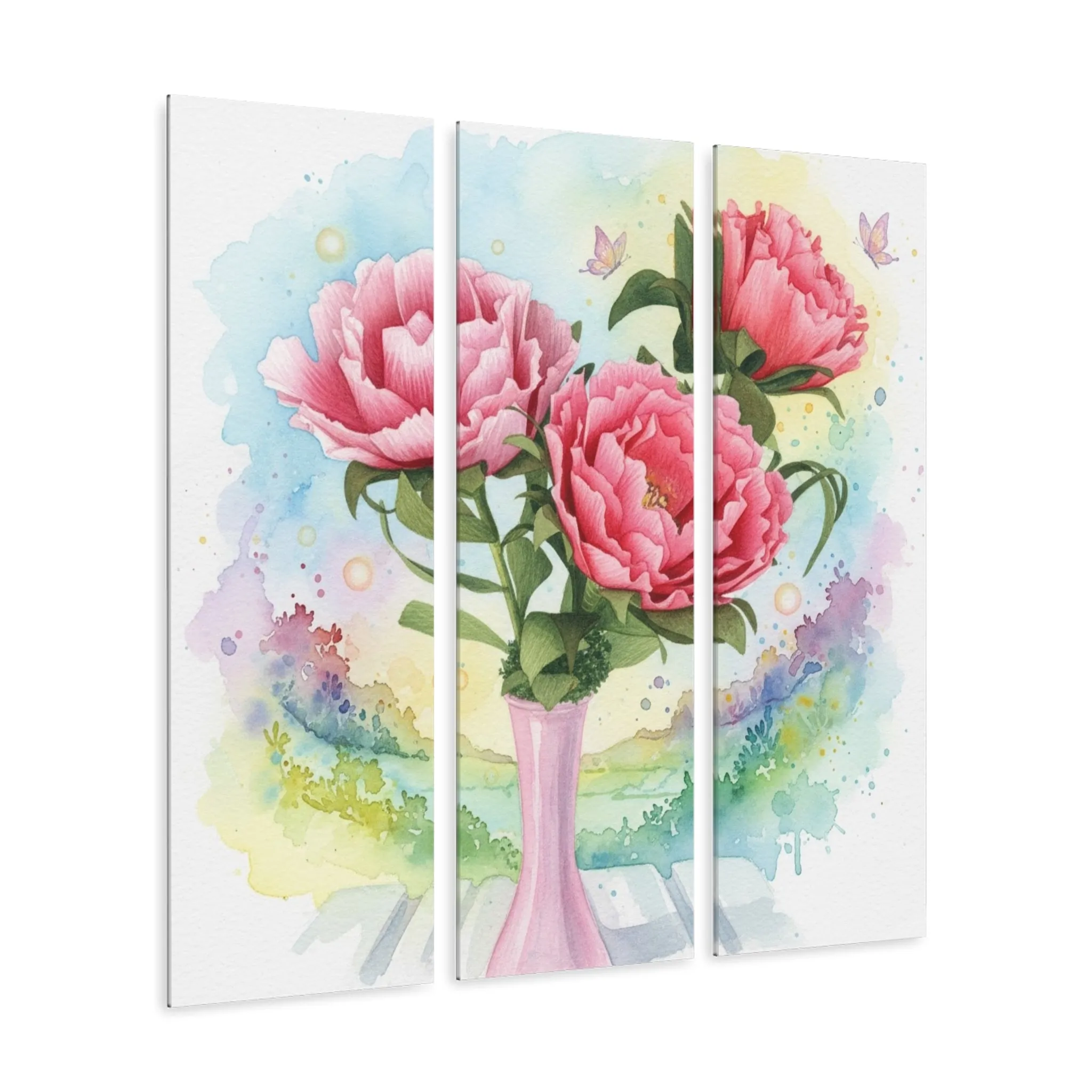
This is especially useful with pink. A larger piece lets the color read as a deliberate focal point from across the room, while smaller pink accents can disappear into a busy setting or multiply into a theme. For a sofa wall, choose a shape that echoes the furniture: a wider work or multi-panel arrangement for a broad sofa, a vertical piece for a narrower reading corner, and a balanced pair where a single work would feel lost.
Above a bed, start with the headboard rather than the entire wall. Above a console, use the console’s centerline as the anchor. This simple approach avoids the common off-center feeling that happens when furniture and artwork each follow a different imaginary midpoint.
Use contrast to keep the room from going one-note
A pink floral needs a counterweight. That does not mean every room needs black accents or a dramatic green wall. Often the counterweight is material: the grain of oak, the nubby surface of linen, a woven shade, a stone lamp base, or one leafy plant. Those quieter textures give the flowers something to push against, so the color feels more grown-up and less like a single-theme room.
Green is an especially natural companion because it already lives inside the artwork as stems and leaves. A muted sage wall, olive pillow, or plant can make blush and rose tones look fresher. If the art has a pale background, a deep green or charcoal accent can provide a sharper frame around it. If the art is already high contrast, keep the rest of the palette simple and let the flowers remain the strongest moment.
When pattern is part of the room, vary the scale. A large open floral can coexist with a small check, narrow stripe, or quietly textured rug because each pattern has a separate job. What tends to create visual noise is putting several patterns of the same size and density beside one another. Interior designers interviewed by Livingetc describe this same balance: a shared color story and varied scale let different patterns sit together without competing.
Choose the floral mood that suits the room
Pink floral art can feel calm, romantic, cheerful, formal, or modern depending on the composition. A loose watercolor with open background space tends to soften a bedroom or reading nook. A close-up bloom feels more expressive and can carry a living room wall on its own. A vase, stem, or garden arrangement adds a little structure and often works well in an entry, dining room, or home office.
Look for the amount of negative space, not just the flower. Open backgrounds make the piece feel airy and give nearby furniture permission to remain simple. Dense petals and dark fields create more drama. Neither is better, but they ask different things from the room. In a small room with patterned bedding, curtains, or rugs, an open floral usually provides relief. In a minimal room with plain walls and clean-lined furniture, a fuller floral can be the visual warmth that keeps the space from feeling unfinished.

Make a quick test before you commit
Decorating decisions become easier when you test them at the right scale. If the piece is already in your home, lean it against the wall for a day or two before hanging it. Look at it in morning light, lamp light, and from the doorway. If you are choosing online, use painter’s tape to mark the artwork’s overall width and height on the wall. It is not glamorous, but it quickly answers whether you need one larger piece, a vertical format, or a wider composition.
Then check three relationships. First, is the pink visible from the distance where you will normally see it? Second, does the background of the artwork work with the wall color, or does one make the other look dull? Third, does the artwork have a clear place to land visually, with furniture, a lamp, or a console beneath it? If the answer is yes to all three, you have moved beyond a color impulse and into a composition that will hold together.
Do not worry if one unexpected detail changes the plan. A darker rug might make a lighter floral look fresher. A warm wood headboard may pull a cooler blush toward a more balanced middle ground. The room is the final test, and it is allowed to have the last word. Once the art feels right from the place where you actually sit or walk by, the smaller coordinating choices become much less complicated.
Take a quick photograph from the doorway before you decide. Seeing the wall in a frame can make an awkward gap, a piece that is too small, or a color that is getting lost much easier to notice. It also keeps the decision tied to the view you will actually live with, rather than to a close-up inspection of the artwork.
Match the finish to the light you live with
The way a floral piece catches light matters as much as its palette. Canvas has a softer, more tactile presence and works naturally with relaxed textiles, painted wood, and layered rooms. Acrylic has a crisper surface and can make pinks appear more luminous, especially on a wall that receives indirect daylight. Metal can bring clarity and reflect a little more of the room around it. A framed print adds a defined edge when the space needs extra structure.
Think about the viewpoint you use most. The view from the sofa, the bed, the kitchen island, or the front door matters more than inspecting the artwork from six inches away. On a wall that gets strong sun, look at it at different times of day. On a darker wall, a clean finish and a lighter ground can help the artwork stay visible without turning on extra lighting.
The piece does not need to match every finish in the room. It simply needs to belong among them. Warm wood and linen can make a polished acrylic floral feel less precious. A crisp black frame can make a soft pink print feel more graphic. The right contrast gives the work a role instead of making it blend into the background.
Give the artwork enough quiet around it
Once the art is up, resist the urge to fill every inch around it. Pink florals often look their best when they have a little clear wall and a few supportive objects below. A lamp, a stack of books, a vase, or one plant can echo the color story without repeating it. Too many small signs, frames, or bright accessories turn the wall into a collection of competing decisions.
This is where a room starts to feel personal rather than staged. Use the artwork as the starting point, then pull out one subdued color or material from it. The goal is not a catalog-perfect set. It is a room where the art connects the things you already enjoy living with. A practical pink floral decorating roundup lands on the same useful principle: a single focal piece, supported by warm neutrals or deep green, gives the color more room to breathe.

Find pink floral wall art that feels like you
The best choice is not the one that checks every decorating rule. It is the piece that gives you the right feeling when you enter the room. Use scale to make it belong, undertone to connect it to the palette, and contrast to keep it from feeling flat. Then leave space for the artwork to do what it came to do.
Artisan’s Studios makes floral wall art in canvas, acrylic, and metal finishes, including rose, peony, lily, and gerbera designs. Browse the wall art collection when you want to compare pieces, or use the studio’s watercolor floral wall art guide to narrow the finish and mood that fit your room.
Frequently asked questions
What colors go with pink floral wall art?
Warm white, cream, oatmeal, natural wood, muted green, and soft sage are dependable partners for blush and rose florals. For a more dramatic room, pull a darker green, charcoal, or deep plum from the artwork rather than adding another bright accent color.
Can pink floral wall art work in a modern living room?
Yes. Choose a composition with clear negative space, a limited palette, or a crisp finish such as acrylic. Keep nearby furniture and accessories simple so the flowers provide the organic movement while the rest of the room stays calm and edited.
Where should I hang pink floral wall art?
Give it a wall where it can be a focal point, such as above a sofa, bed, console, or dining-room sideboard. Center it to the furniture beneath it, not automatically to the full wall, and leave enough open space around the edges for the piece to register.
How do I keep pink floral art from feeling too sweet?
Use pink as part of a wider palette. Natural wood, linen, woven texture, dark green, and a restrained frame or finish add contrast. A larger-scale artwork with open space around the blooms also tends to read as more intentional than several small, busy floral pieces.
Related posts

Related reading
Floral Wall Art for a Living Room: A Practical Guide
Choose floral wall art for a living room by balancing scale, color, light, and the way people gather there.
Related reading
Floral Wall Art for a Bedroom: A Calmer Way to Choose
Choose floral wall art for a bedroom that feels restful, personal, and in balance with the bed and light.
Related reading