
Neutral floral wall art is for the room that needs life, not noise. It can warm up a white wall, soften a clean-lined sofa, or give a bedroom a more personal center without forcing the rest of the room to match it. The flowers are there, but they do not have to shout. A cream ground, a soft green leaf, a faded rose, or a warm brown stem can carry just enough movement to make a quiet room feel finished.
The secret is to think beyond beige. Neutral does not mean colorless, and it does not mean that every part of the artwork has to blend into the wall. It means the palette has restraint. The art relies on value, shape, texture, and a few carefully chosen tones rather than one loud color. This guide helps you choose neutral floral wall art that keeps its character while letting the room feel easy to live in.
Start with the undertone already in the room
Before you look at flowers, look at the fixed things you are keeping: the wall paint, sofa, rug, floor, wood furniture, and curtains. Most rooms already lean warm or cool. Warm rooms often have cream, oatmeal, tan leather, honey wood, brass, terracotta, or soft olive. Cool rooms tend toward clear white, charcoal, stone gray, blue-gray, or black metal. The artwork does not need to copy those colors, but it should understand them.
That makes undertone more useful than a label like beige. A warm ivory background beside a cool white wall can look yellowed or disconnected. A gray floral on a room full of warm oak can feel accidental unless another cool detail repeats it. Hold a product image beside a photo of the room and look for the dominant temperature. A thoughtful guide to floral color palettes makes the same practical case: matching the undertone matters more than matching every shade.
Once you know the room’s temperature, pick one quiet bridge from the art. It may be a soft leaf green that speaks to a plant, an ivory that relates to the curtains, or a muted rose that repeats in a book spine. One connection is enough. Trying to echo every petal in pillows and accessories is how a calm room turns into a theme.
Choose value contrast before you choose more color
Neutral floral art needs a little separation to stay visible. Look at the difference between the lightest and darkest parts of the piece, not only at its colors. A cream flower on a taupe field, a pale bloom with a charcoal center, or a soft watercolor with a defined stem can all read clearly without becoming bright. If the artwork and wall are the same value, the piece may vanish from the doorway even when it looks lovely up close.
On a pale wall, a floral with a warmer background, a darker outline, or a visible frame has a better chance of holding the wall. On a deeper wall, a lighter ground or pale petals can lift the composition. This is also why a neutral piece can feel more interesting than a colorful one. The eye notices the relationship between light and dark first, then starts to discover the gentler color shifts as you move closer.
Do not confuse contrast with harshness. You are not looking for a black-and-white graphic unless that suits the room. You are looking for enough visual structure that the art has a clear silhouette. A good check is to glance at a thumbnail or step back several paces from the screen. If you can still tell where the floral mass begins and ends, the piece probably has enough presence for a neutral room.

Let scale give the artwork its authority
A neutral palette often benefits from a more confident scale. When an artwork is too small above a sofa, bed, or sideboard, the room can feel unfinished and people tend to compensate with several smaller objects. One well-sized floral piece is usually calmer. It gives the wall a focal point without asking for extra frames, shelves, or decor around it.
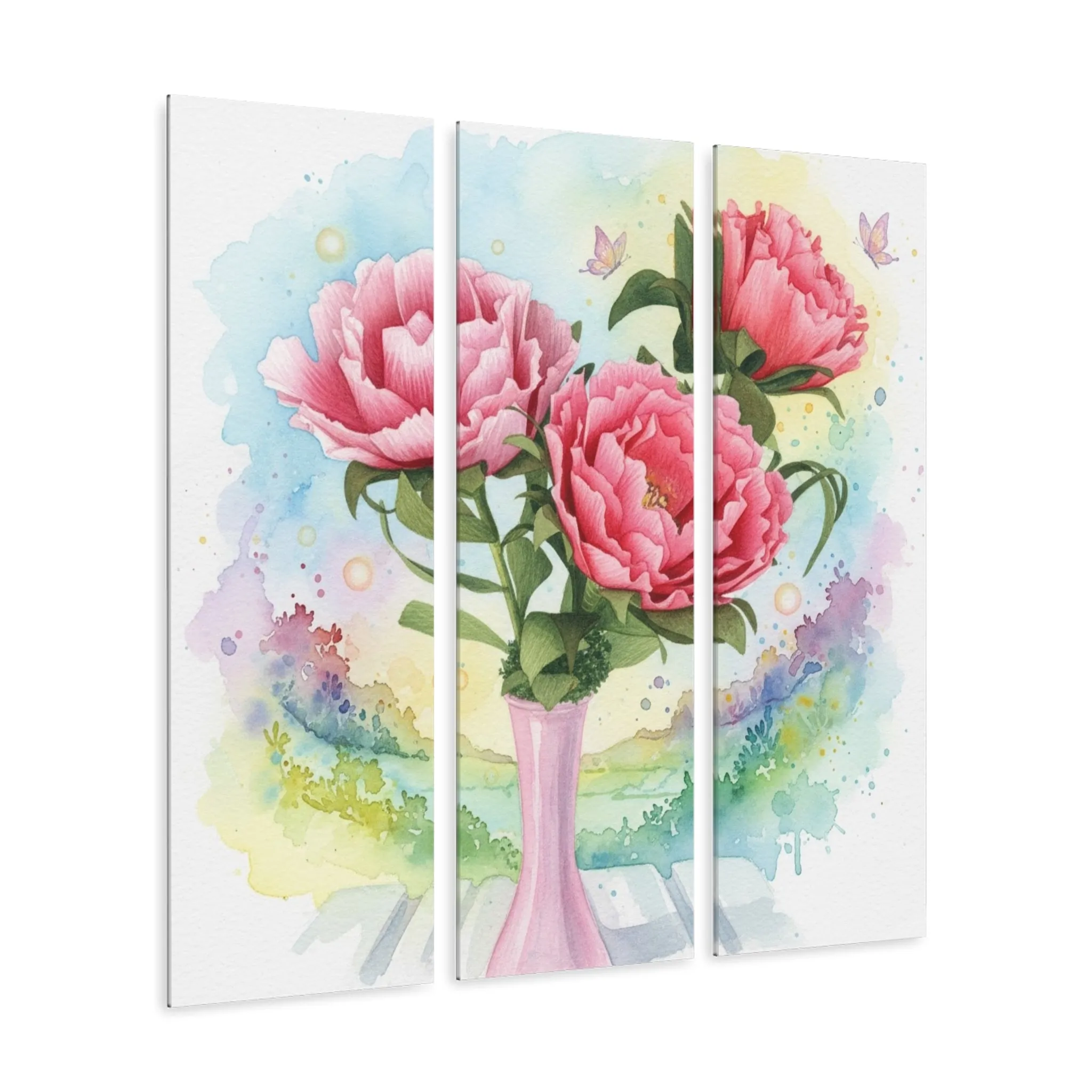
Start with the furniture below. Center the artwork to the sofa, headboard, console, or table, not automatically to the entire wall. Use painter’s tape to mark the outer width and height before ordering. Then look at the taped shape from the doorway and from the seat you use most. The right size feels connected to the furniture without crowding its edges. For a wider wall, a horizontal work or a triptych can create that relationship while preserving some breathing room.
Scale also changes the emotional effect. A small botanical can feel like a quiet discovery in a reading corner or hallway. A large, pale floral becomes a steadier presence above a sofa or dining sideboard. The room decides which role is useful. As a practical starting point, many decorators use an artwork that spans roughly two-thirds to three-quarters of the furniture beneath it, then adjust for wall space and visual weight. The point is proportion, not a rigid measurement.
Use the composition to set the room’s volume
Floral art can be quiet even when the subject is recognizable. Look for open background space, a simple vase, a few stems, or one clear bloom when the room already has patterned textiles, textured furniture, or strong architecture. The artwork will add organic movement without creating another dense surface for the eye to sort through.
A fuller bouquet or closer crop can work just as well in a more minimal room. If the sofa is simple, the rug is plain, and the wall has a lot of clear space, a denser floral gives the room warmth and a focal point. The question is not whether flowers are inherently busy. It is whether the artwork is being asked to compete with other active elements at the same time.
Think in terms of visual jobs. Let one element take the leading role. If the room already has a patterned rug, choose art with a more open composition. If the room is mostly smooth plaster, linen, and wood, the floral can carry a little more detail. A room looks considered when its pieces take turns being noticed, not when every surface tries to be the main event.
Use texture and finish with intention
Neutral art often gets its interest from surface. Canvas has a softer, more tactile presence that works beautifully with linen, wood, woven shades, and layered rooms. Acrylic has a crisper finish and can make delicate color shifts appear more luminous. Metal offers clean edges and a little reflected light, which can help a floral remain visible on a deeper wall or in an entry that does not get much daylight.
Consider the light that reaches the wall, too. Morning sun, evening lamps, and overhead lighting can each change how pale petals and soft backgrounds read. You do not need a complicated lighting plan. Simply look at the wall at the time you use the room most. If it is naturally dim, favor a floral with a lighter ground or more defined silhouette. If it gets strong sun, a softer canvas finish may help the work feel settled rather than shiny.
The material around the artwork can create enough contrast without adding another color. A warm oak console beneath an acrylic floral, a dark frame around a soft watercolor, or a woven lamp shade beside a smooth print can give a neutral composition depth. As a guide to textured floral art notes, surface and light often decide whether a pale floral feels quietly dimensional or simply disappears into the room.
Test the piece in the view you actually live with
Before you hang anything, test the outer dimensions with painter’s tape or lean the artwork against the wall for a day. Look from the doorway, from the sofa, and in both daylight and evening light. Those are the views that matter. Close inspection is useful for appreciating brushwork or print detail, but the everyday room has to work from a few steps away.
Take a quick photograph from the normal entry point. A phone photo compresses the room enough to show what is competing. You may notice a piece is too high, too narrow, too close in value to the wall, or better than expected beside the floor and furniture. It is a simple test that replaces a lot of second-guessing.
If the work feels almost right, change one thing at a time. Lowering it a few inches, clearing a crowded shelf, or adding a lamp with a warmer shade can make more difference than replacing the artwork. Neutral floral wall art is meant to be flexible. It should give the room a softer landing place for the eye, not create a fragile arrangement that works only when nothing else changes.
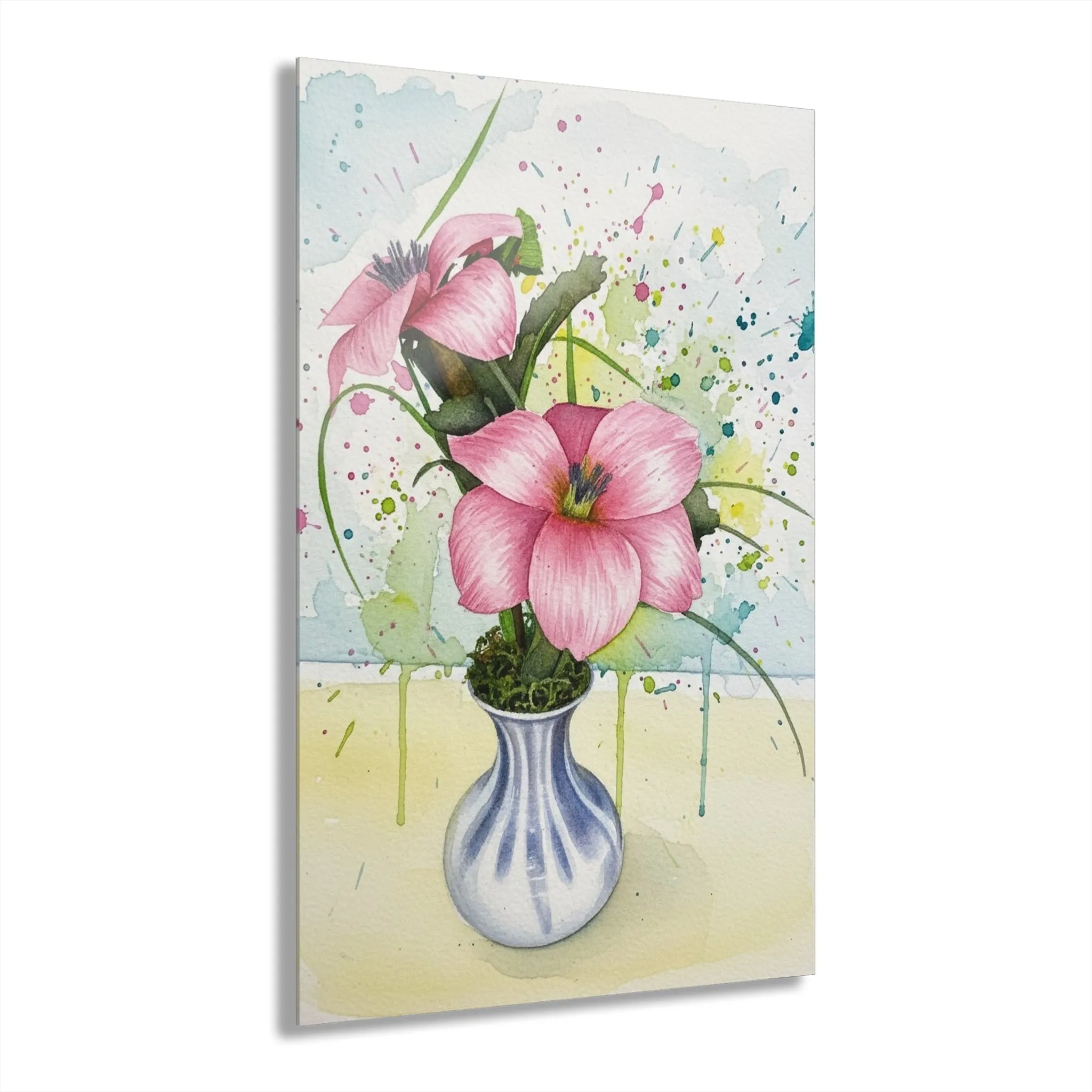
It is also worth testing how the artwork relates to the empty wall around it. A neutral piece can look more expensive and more intentional when it is not hemmed in by switches, shelves, or a crowded row of smaller frames. If the wall has an unavoidable interruption, such as a doorway or window, let the art respond to the remaining shape instead of forcing it to fill the entire span. A vertical vase composition can make a slim wall feel purposeful; a broad, open floral can steady a long sofa wall. The goal is not to erase every blank patch. It is to give the room a clear rhythm, with a few places for the eye to rest between the furniture, the art, and the architecture.
Find neutral floral wall art with a point of view
The best neutral floral wall art is never just filler for a blank wall. It uses gentle color, value contrast, scale, and shape to make a room feel more settled. Choose an undertone that belongs with the finishes you already love, give the composition enough contrast to be seen, and let the furniture below it set the scale. Then leave it some quiet space to do its work.
Artisan’s Studios offers floral pieces in canvas, acrylic, and metal, from softer vase compositions to larger statement florals. Browse the wall art collection, explore watercolor floral wall art, or use the studio’s floral wall art guide to compare placement, mood, and finish before choosing.

Frequently asked questions
What colors count as neutral floral wall art?
Neutral floral art often uses cream, warm white, taupe, soft gray, muted green, brown, or gentle blush as its main palette. It can still include a small touch of rose, ochre, or deep green. The key is that no bright color dominates the wall from across the room.
Can neutral floral wall art work on a white wall?
Yes, provided the artwork has enough difference in value, texture, or outline to remain visible. A warm ivory floral can look beautiful on white when the background, frame, or flower centers create a clear edge instead of disappearing into the paint.
How do I keep neutral floral art from looking bland?
Choose one source of contrast. That may be a deeper stem color, a warm wood frame, a stronger flower silhouette, a crisp finish, or a little space around the work. Neutral art feels intentional when it has shape and hierarchy, not when every element is equally pale.
Where should I hang neutral floral wall art?
It works especially well above a sofa, bed, sideboard, console, desk, or in a quiet entry. Let the furniture beneath it set the centerline and use painter’s tape to test the outer size before you commit.
Related posts

Related reading
Floral Wall Decor Ideas That Make a Room Feel Finished
Seven practical floral wall decor ideas for adding color, scale, and personality without crowding the room.
Related reading
Floral Wall Art for a Living Room: A Practical Guide
Choose floral wall art for a living room by balancing scale, color, light, and the way people gather there.
Related reading
Floral Wall Art for a Bedroom: A Calmer Way to Choose
Choose floral wall art for a bedroom that feels restful, personal, and in balance with the bed and light.
Related reading