

Floral wall art can do more than fill an empty patch of wall. It can soften a room with color, give a quiet corner a focal point, or pull the pieces you already own into one considered picture. The challenge is not finding flowers you like. It is choosing a piece that feels right at the scale, in the light, and beside the furniture you live with every day.
A good choice starts with a few simple questions: What should the room feel like when you walk in? Where will your eye land first? Does the space need a single moment of color or a gentler layer of detail? Use this guide to narrow the options before you start browsing, then let your own response to the artwork make the final call.
1. Start with the room, not the empty wall
Before choosing a floral subject, take in the room as a whole. Look at the materials that carry the most visual weight: the sofa, rug, headboard, dining table, cabinetry, and window treatments. A room with pale linen, light wood, and natural texture often welcomes soft watercolor blooms. A room with sharper lines, darker paint, or metal accents may call for a bolder floral silhouette or a finish with more presence.
Then decide what job the piece should do. In a calm bedroom, floral art might be there to keep the room from feeling too spare. In a living room, it may be the color note that makes the whole seating area feel finished. In an entry, it can set the tone before the rest of the home comes into view. Naming that job makes the choice less vague.
Try describing the room in three words, such as airy, grounded, and warm, or bright, collected, and playful. Artwork that carries the same mood will feel intentional. Artwork that offers a useful counterpoint can be even better, but make that contrast a choice rather than an accident.
2. Choose the right visual scale
Scale is usually what separates a piece that feels at home from one that feels lost. Measure the width of the furniture beneath the art, rather than measuring only the wall. Above a sofa, bed, console, or sideboard, the artwork should create a clear relationship with the piece below it. Leave visible breathing room at both ends so the wall composition has shape.
Large floral wall art can make a room feel more settled because the eye has one confident place to land. Smaller art can work beautifully too, especially in a reading nook, hallway, powder room, or beside a door, but it needs a deliberate role. If you are drawn to a smaller piece for a generous wall, consider pairing it with another related work or placing it where furniture naturally narrows the visual field.
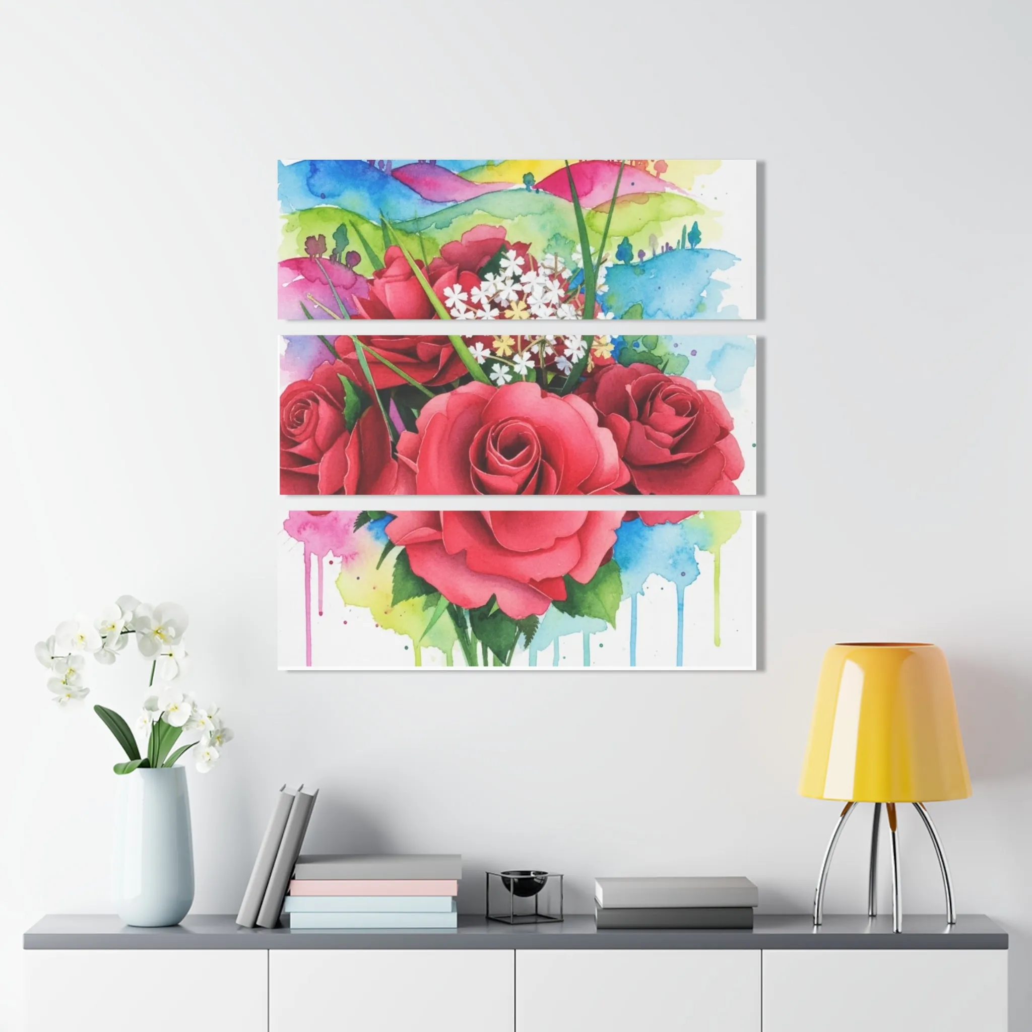
Triptych artwork is useful when you want a wide horizontal presence without one solid block of color. The pauses between panels let the wall breathe while the flower motif still reads as a unified composition.
3. Let color connect the room
You do not need to match every pillow, curtain, or vase. In fact, exact matching can make a room feel more staged than lived in. Instead, look for one or two colors already present in the space and choose floral art that acknowledges them. A soft green leaf can speak to a plant, a muted blush can pick up a rug detail, and a warm ivory background can keep the room feeling open.
Next, decide whether the flowers should blend in or wake the room up. Blending is useful when the room already has a lot going on. A gentle palette, airy background, and smaller scale keep the atmosphere calm. Contrast is useful when the space needs energy. Deep ruby roses, a bright gerbera, or a strong botanical shape can become the note that makes neutral furniture feel personal.
Pay attention to undertones, especially with whites and neutrals. Cream, linen, almond, and warm gray tend to sit comfortably with earthy greens, terracotta, coral, and honeyed wood. Cooler whites and charcoal often make cleaner pinks, blue flowers, or crisp black framing feel more natural. This is not a hard rule, just a way to avoid choosing a beautiful print that fights the room around it.

4. Match the floral style to the feeling you want
Floral art has a wide emotional range. Loose watercolor petals can feel quiet and romantic. A close-up bloom can feel expressive and immediate. Fine botanical stems often feel measured and calm. A dramatic rose composition can make a room feel richer, more formal, or more cinematic. Think less about whether flowers are your style and more about which version of flowers matches the room you are shaping.
For an easy, everyday feeling, choose artwork with movement and some open space around the blooms. It tends to sit well with relaxed furniture, natural materials, and rooms that are used often. For a more polished setting, consider a tighter composition, a darker field, or a more luminous finish. The flower itself can stay soft while the format makes the piece feel more dressed up.
It also helps to consider what you want the art to say from across the room. From a distance, a bold bloom reads as color and shape. Up close, watercolor texture, layered petals, and smaller botanical details become part of the reward. The strongest pieces work at both distances.
5. Consider the finish and the light in the room
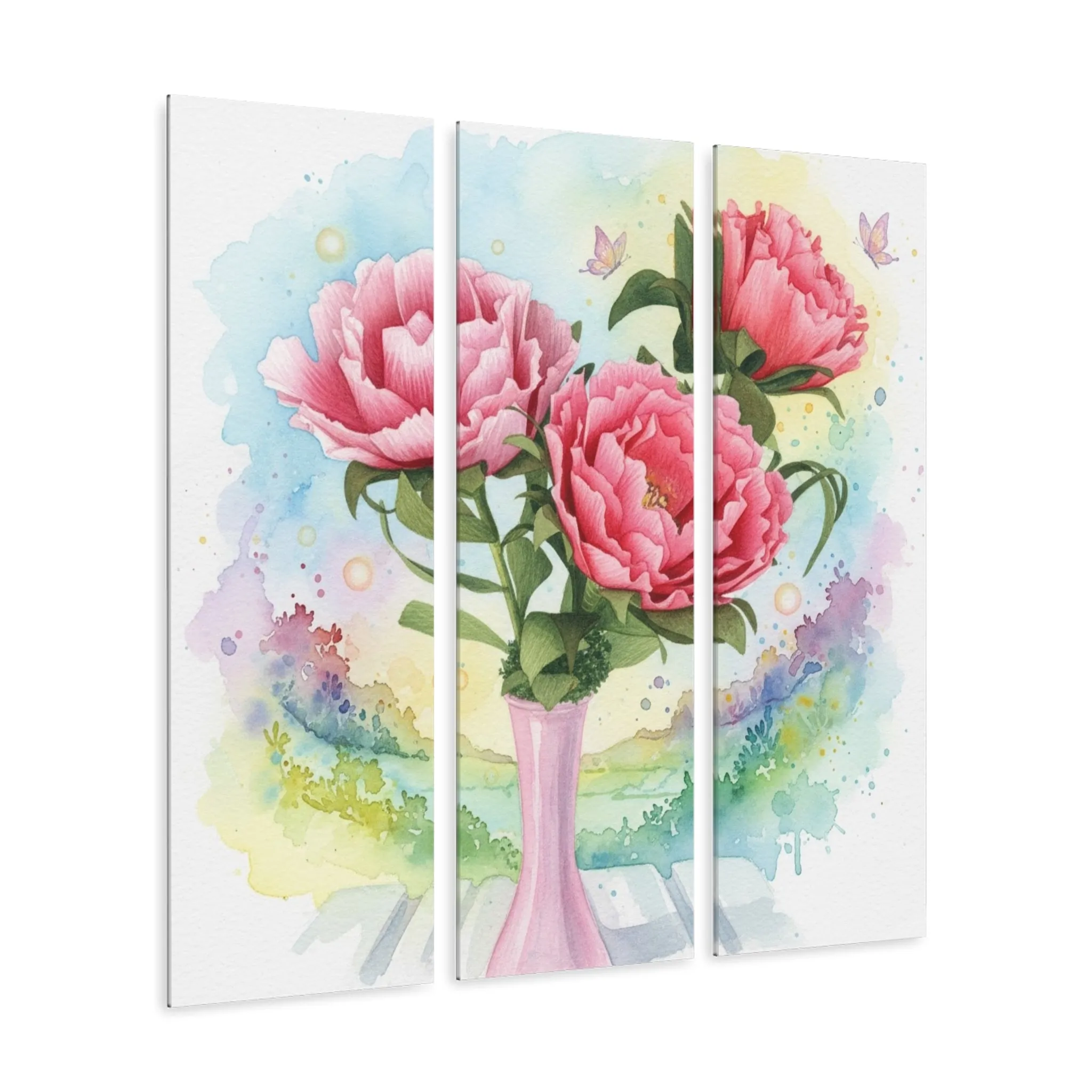
The finish changes how floral wall art behaves throughout the day. Canvas has an easy, tactile presence and can feel at home in casual rooms. Metal and acrylic have more surface energy, which can make color appear cleaner and more vivid. A framed print can add structure, especially where the room needs a little more definition around the artwork.
Look at where daylight falls and where lamps create pools of light at night. A soft, matte look may suit a room that gets strong sun for much of the day. A glossy or luminous piece can be especially effective where the wall is a little darker and you want the artwork to catch light as people move through the room. The goal is not to make the artwork shout. It is to make sure it can still do its job in the light you actually have.
When possible, stand where you will most often see the piece: at the kitchen island, from the bed, on the sofa, or as you come through the front door. That viewpoint matters more than a close inspection from six inches away.
6. Give the artwork room to breathe
Once you have chosen the piece, placement finishes the decision. Center it with the furniture below, not necessarily with the entire wall. This keeps the composition grounded, especially when a sofa, bed, or console defines the space. In a gallery arrangement, use consistent gaps and let one stronger piece act as the visual anchor.
Floral art also benefits from a little quiet around it. Avoid crowding it with several small objects, competing signs, or too many unrelated colors nearby. A lamp, a branch in a vase, or a few books can support the composition. The wall does not need to explain the artwork. It just needs to make room for it.
If you are unsure, use painter’s tape to mark the outer dimensions before hanging. Step back, take a photo, and look again later in the day. That small pause often tells you whether the scale is right before you commit.
7. Use a short decision checklist before you buy
It is easy to keep comparing pieces long after you have found a good option. A simple checklist brings the decision back to the room and makes the final choice clearer. Start with the wall itself: Is the piece wide or tall enough to feel present from the place you normally sit or stand? Next, check the color: Does it repeat, soften, or purposefully contrast something already in the room? Finally, check the feeling: Would you still want to see this art every day, not only in a product photo?
For rooms you use for rest, choose the artwork that lowers the visual volume. It might have a quieter palette, more negative space, or a looser watercolor edge. For rooms where people gather, choose the piece that gives the space a little more conversation and energy. A rich flower, a strong horizontal format, or a surface that catches light can help the wall hold its own against the activity around it.
When you are choosing floral wall art as a gift, the same questions still apply, but the room may be less familiar. In that case, it is usually safer to choose a versatile subject and a finish that can work in more than one setting. Botanical greens, soft pinks, ivory backgrounds, and floral scenes with open space tend to give the recipient more freedom to make the piece their own. A bold, more specific color is a wonderful choice when you know it connects to a favorite flower, a meaningful room, or the person’s existing style.
Do not overlook the practical side of the decision. Consider the surface where the art will hang, how close people will stand to it, and whether the room gets the same light all day. A piece for a narrow hallway needs to hold up at close range. A piece for the far end of a living room needs enough shape and color to register from a distance. Those small conditions often tell you which format will feel most natural.
One final test: picture the wall a month from now. If the artwork makes the room feel more like the person who lives there, it is doing its job. The best floral art does not have to explain itself. It just keeps giving the room something to come back to.
How Artisan’s Studios helps you find the right piece
Artisan’s Studios begins with the expressive forms of handmade florals and carries that sense of care into watercolor-inspired wall art. The collection includes floral pieces in canvas, metal, acrylic, and print formats, so you can choose an artwork that fits the mood of the room as well as the surface and scale you need.
Start with the wall art collection to see the available pieces, or browse the Bloom Reimagined collection for floral work shaped by the studio’s paper-to-watercolor process. If you are choosing for a particular wall and want a second opinion, contact the studio with the room, dimensions, and colors you are working with.
Questions people ask about floral wall art
What floral wall art works best in a small room?
Choose one piece with an open background, a clear focal bloom, and enough breathing room around the edges. A single well-sized print usually feels calmer than several small pieces competing for attention.
Should floral wall art match the colors in my room exactly?
No. A close color relationship is usually enough. Let the art repeat one or two existing tones, then use the remaining colors to add a little contrast and life to the room.
Can I use floral art in a modern room?
Yes. Choose a simplified botanical composition, restrained palette, or crisp metal or acrylic presentation. The frame and finish can make the same floral subject feel tailored and contemporary.
How do I choose art for above a sofa or bed?
Start with the furniture width, then choose artwork that creates a deliberate visual span without reaching all the way to the edges. A wide horizontal piece or a balanced pair often makes the strongest starting point.
Related posts

Related reading
How to Create a Floral Gallery Wall That Feels Collected
Build a floral gallery wall with an easy layout, a clear visual thread, and art that feels personal.
Related reading
Large Flower Wall Art: How to Choose the Right Size
Choose large flower wall art that gives your room a focal point without overwhelming the space.
Related reading
Floral Wall Art for a Living Room: A Practical Guide
Choose floral wall art for a living room by balancing scale, color, light, and the way people gather there.
Related reading