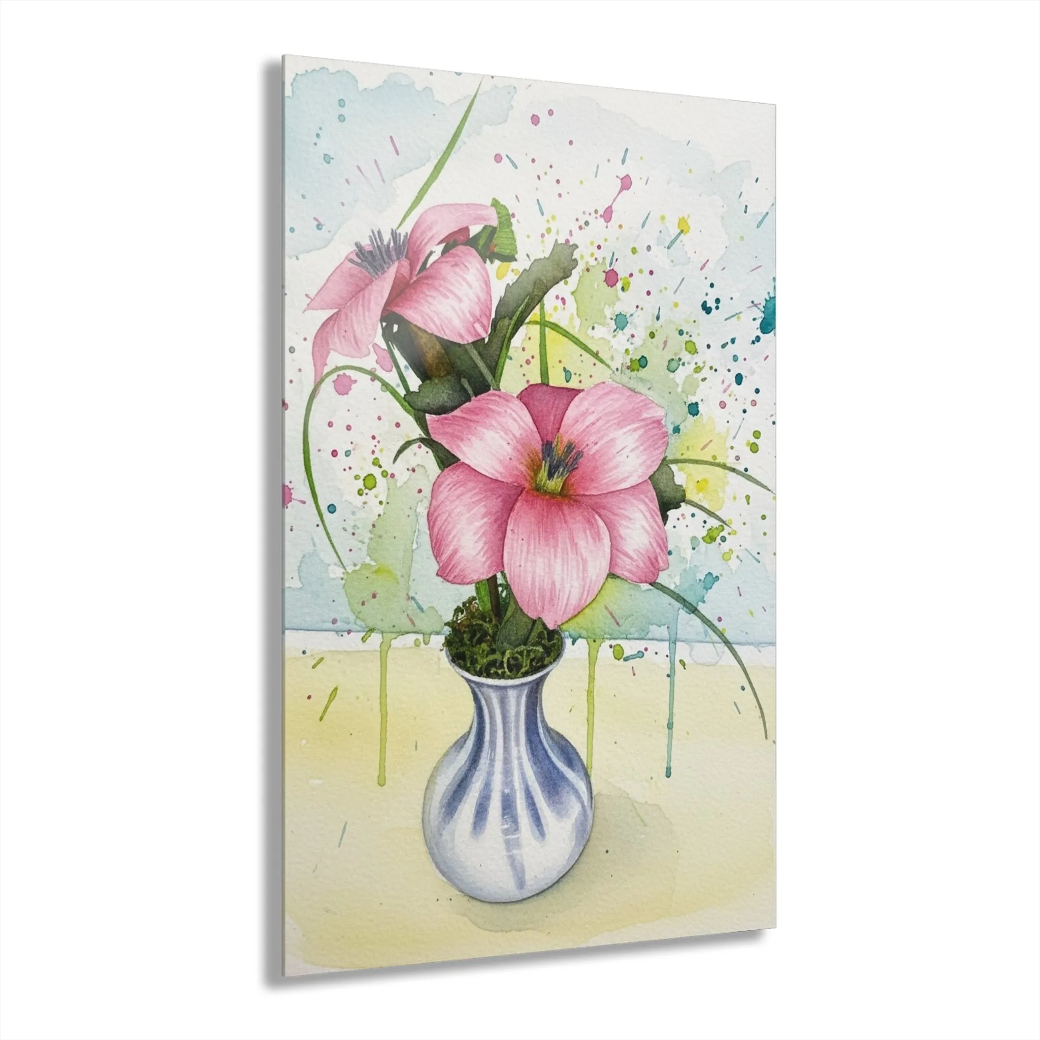
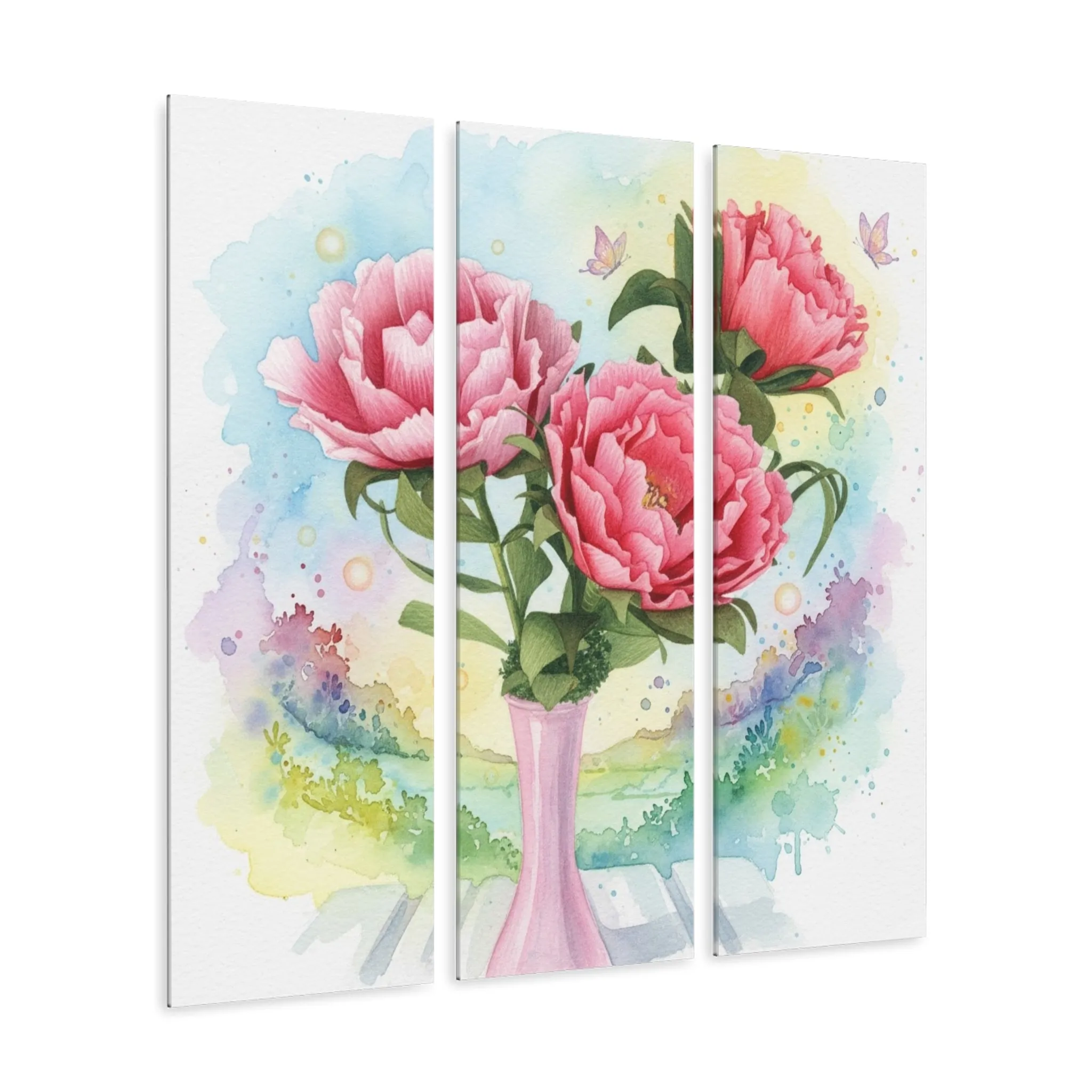
Pink floral art does not need a pink room. It often works best when it is the one expressive note among quieter materials. In a cream or white room, a pink bouquet can keep the space from feeling flat. Near natural wood, it brings out warmth that is already there. In a room with charcoal, black, navy, or olive accents, the flowers create contrast that feels lively and balanced.
Scale helps that color land well. Above a bed, sofa, or console, choose artwork that feels related to the furniture beneath it and leave space at the sides. A piece that is too small can make a large wall feel unfinished, while a piece with enough presence gives the whole area a purpose. On a smaller wall, one compact floral piece often looks more deliberate than a scattered group of little frames.
Consider the height of the wall as well as its width. A tall floral composition can give a narrow space more lift, while a horizontal grouping or triptych settles a broad wall. The flowers do not have to fill every empty inch. A little space around the artwork lets the colors and shapes read clearly from the other side of the room.
Light deserves a look, too. Morning sun can make pale petals feel especially fresh. Evening lamps can deepen rose and berry tones and make an acrylic surface feel more luminous. Take a quick look at the wall at the time you use the room most. That everyday view will tell you more than the brightest spot in the house at noon.
If you are buying a gift, choose the mood before you chase an exact color. A pink lily or peony can feel romantic and polished. Gerberas feel bright and welcoming. A smaller floral canvas or metal piece is an easy choice for a housewarming, birthday, anniversary, or holiday, because it gives someone an artwork they can make part of their own home.